

A founder took the demo experience away from new users, and the number of people who actually used the product went up.
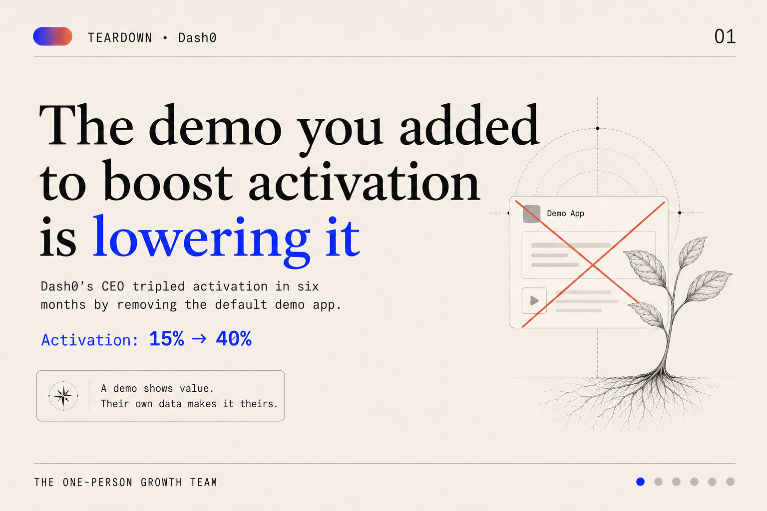
Not a tweak to the demo. Not a shorter tour. He stopped shipping it as the default.
That violates the reflex every PLG team runs on. Time-to-value is the god metric, so you pre-load something shiny — sample data, a populated dashboard, a demo app — and the user “sees it working” in ten seconds instead of ten minutes. Faster aha, better activation. That’s the theory.
Mirko Novakovic, CEO of Dash0, ran the experiment and got the opposite result. Here’s what he actually measured, the four levers that moved the number, the one deletion that mattered most, and a test you can run on your own onboarding before Friday.
First, the definition most teams get wrong
Activation at Dash0 isn’t “signed up.” It isn’t “completed setup” or “finished the tour.”
It’s one behavior: the user sent us their data.
In Novakovic’s own framing, getting users to send data is the hardest step in the entire funnel. Everything before it is preamble. Everything after it is easier.
That choice of unit is the whole game. Sign-ups flatter you. Tour completions flatter you. “Engaged users” flatters you the most, because you get to define engagement. None of them predict retention, because none of them require the user to do the thing the product exists to do.
Reza Soumeeh’s ladder is the cleanest version of this: registration ≠ activation ≠ retention ≠ monetization. Four different rungs, four different failure modes. Most teams report on rung one and call it rung two.
So before you read the rest of this: if the number on your dashboard doesn’t correspond to a user doing the value action with their own work in it, you’re measuring comfort, not progress.
The curve: 15% → 40%
Early on, Dash0 activated somewhere in the range of 10–15% of new users. Six months later, north of 40%.
The unsatisfying part: there was no single hack.
Four levers, compounded.
More integrations — fewer users blocked because their stack wasn’t supported
Better docs — fewer users blocked because they didn’t know the next command
In-product guidance — fewer users blocked because they lost the thread mid-setup
Faster cloud setup — fewer users blocked because the first step was too heavy
Look at what those have in common. Each one removes a specific, identifiable reason a user stalls before the value action. None of them make the value action more impressive. They make it more reachable.
That’s the mental model worth stealing: activation gains are a portfolio, not a silver bullet. You don’t find the lever. You find the reasons, and you delete them one at a time until the floor stops leaking.
Worth doing, too — GrowthSpree’s 2026 benchmark set puts activation as the driver of an estimated 60–75% of trial-to-paid conversion variance. Directional and agency-sourced, so hold it loosely. But directionally it says the obvious thing: this is the highest-leverage number you own.
The deletion: why the demo app was hurting
Now the counterintuitive one.
Every new PLG user at Dash0 got a full demo application by default. Sensible design. The product is observability — an empty observability tool shows you nothing, so you populate it. New user logs in, sees traces flowing, dashboards lit up, the product visibly working. Instant comprehension.
Then they stopped making the demo the default and pushed users toward connecting their own environment instead.
The number of users sending their own data went up dramatically.
The mechanism fits in one line: a demo shows value; their own data makes the product theirs.
A demo lets a user stay a tourist. They’re impressed, they understand what the product does, and they have committed nothing. There’s no reason to come back tomorrow, because nothing of theirs is in there. Connecting their own environment is the moment the product stops being a showroom and starts being their tool — the moment it has something in it that they’d lose by leaving.
Generalize past observability, because this isn’t a devtools quirk. Sample data. Templates. Pre-built dashboards. Guided sandboxes. Anything that simulates the value action can quietly substitute for it. Scaffolding built to help users see value can end up delaying the moment they create it — and users will happily accept the delay, because the simulated version is easier and looks just as good.
The honest caveat: this is one company’s self-reported result, and the reverse is true for plenty of products. For some, a demo is the fastest honest path to the aha, and the real activation gap is ICP confusion or a broken setup step, not scaffolding.
So the takeaway isn’t “delete your demo.” It’s this: measure whether your scaffolding is a bridge to the value action or a comfortable detour around it. Most teams have never checked, because the demo was designed to help and helping things don’t get audited.
Bonus mechanism: feedback with no buffer
One more Dash0 choice that belongs in an activation story, even though it doesn’t look like one.
700+ customers, and no customer success department. Deliberately. A Slack channel per customer, issues routed straight to product and engineering.
Novakovic’s reasoning: if they shipped something painful, the team needed to feel it directly — without a customer success buffer.
Here’s why that shows up in the activation number. Onboarding friction is invisible to the people who can remove it, because they never experience it. A CS layer is very good at absorbing that pain: tickets get resolved, users get unstuck, satisfaction stays fine, and the underlying friction never reaches the person who could delete it in an afternoon.
Short line between the pain and the people who can fix it. That’s an architecture decision as much as an org one.
Run this test this week
Four steps. Maybe ninety minutes, most of it in your analytics tool.
1. Write down your activation event as a behavior the user performs with their own data or their own work. Not “signed up.” Not “completed setup.” Not “viewed the demo.” If you can’t phrase it with the word their in it, you haven’t found it yet.
2. Measure what % of new users hit it. That’s your real activation rate. It will be lower than the number you’ve been reporting. That’s the point.
3. List every piece of scaffolding between sign-up and that event. Sample data, demo environment, templates, tours, checklists, pre-filled projects. For each one, ask the question: bridge or substitute? Does it move the user toward doing the thing, or does it let them feel like they already did?
4. Pick the one you most suspect is a substitute, and A/B removing it as the default. Not deleting it — demoting it. Available on request, not served automatically. Then watch the value-action rate. Not sign-ups, not session length, not tour completion. The rate at which users put their own data in.
If the number goes up, you just found out your onboarding was competing with your product.