

AB Tasty’s product tour had a 2% completion rate. Ninety-eight out of every hundred people who started it walked away somewhere in the middle.
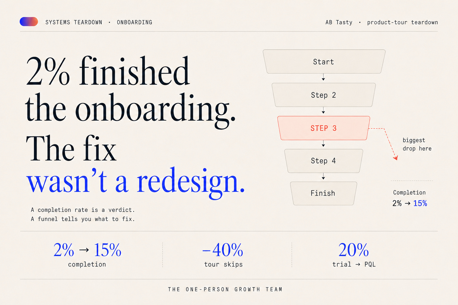
If you’ve ever opened a dashboard and seen a number like that on your own onboarding, you know the reflex: the tour is bad, let’s rebuild it. I’ve watched teams burn a quarter on that reflex. What makes this teardown worth your five minutes isn’t the redesign — it’s the number they went and measured before they touched anything.
The reflex that burns weeks
The pattern is always the same. Onboarding metric is flat → “our onboarding is bad” → “let’s redesign the flow.”
It feels decisive. It’s the most expensive move available to you.
A redesign bets the entire flow on a hunch, before anyone has established where users actually leave. You end up rebuilding the 90% that was working fine in order to avoid the ten minutes of instrumentation that would have told you about the 10% that wasn’t. And when the new version lands, you’ve changed so many variables at once that you can’t attribute the result either way — so the next time the number goes flat, you’re back to guessing.
Guessing is free. Being wrong at scale isn’t.
What AB Tasty did instead
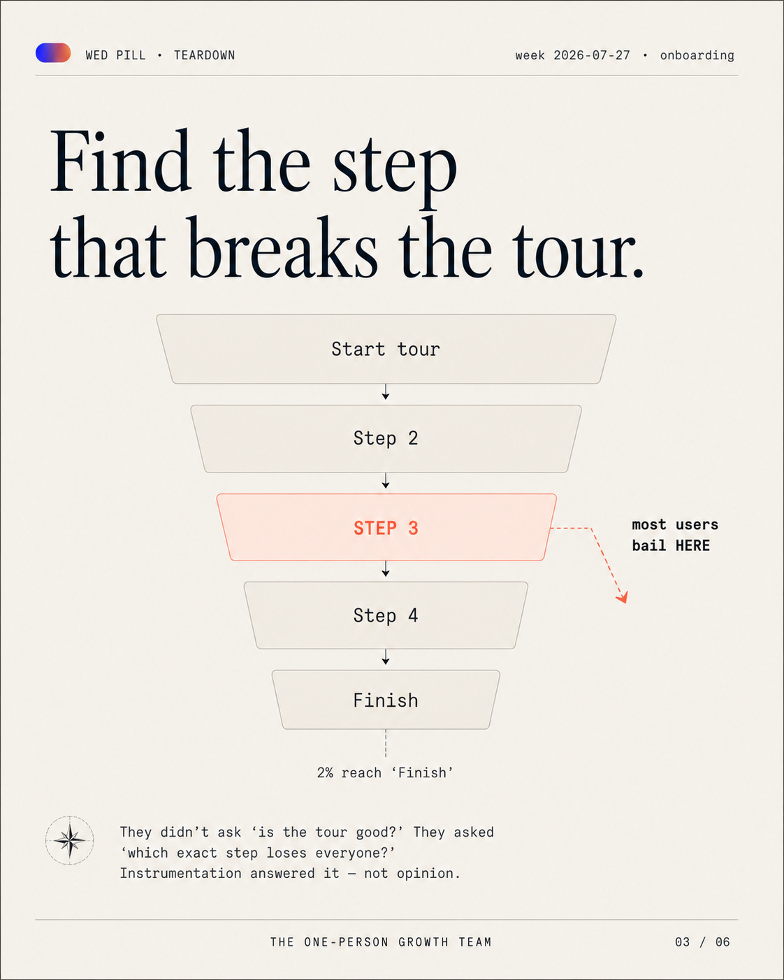
They treated the tour as a funnel, not a feature.
Tour started → step → step → step → finished, instrumented end to end in Mixpanel, with Appcues driving the flow itself. That gave them something a completion rate can never give them: a shape. Not “the tour is broken” but “here is the step where the floor falls out.”
Then they changed the tour based on that shape and re-measured the same funnel.
What moved:
Tour completion: 2% → 15%
Users skipping the tour: −40%
Free trial → PQL: 20% — the goal they’d set, reached over a few quarters
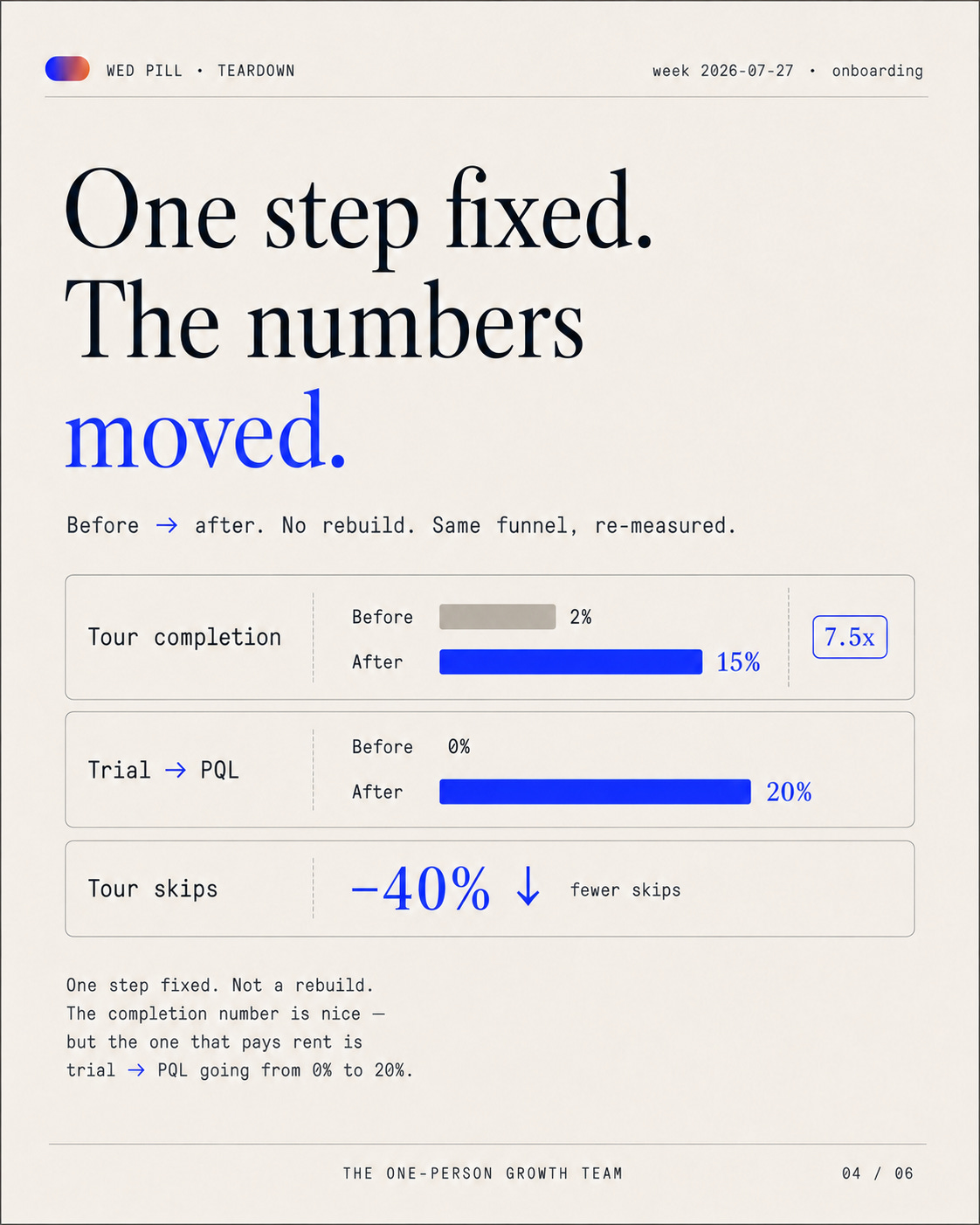
Look at which of those three actually matters. Completion went up 7.5x, and completion is the one I’d throw away. Skips dropping 40% is a better signal — that’s people deciding the tour is worth their attention instead of hunting for the X. But one in five trial signups turning into a product-qualified lead is the only number on that list a CFO recognises. It’s the one the funnel was built to move.
Here’s the part most teardowns leave out, and it’s the most useful part: 15% completion is still bad. Chameleon’s 2026 benchmark, drawn from around 15 million in-app tour interactions, puts the average tour completion rate near 61%. So AB Tasty’s “after” number is a fraction of the industry average — and the business outcome moved anyway.
Sit with that. The vanity metric stayed unimpressive and the revenue metric hit its target. If completion rate had been the goal, they’d have called this a failure and kept redesigning.
Why a completion rate fooled everyone
A rate is a verdict with no cause attached.
“2%” tells you something is broken and nothing about what to touch. You can stare at it for a week and the only thing it will ever suggest is rebuild me — because a single aggregate number has exactly one failure mode and exactly one implied fix.
A funnel is a map. “Step 3 loses 71% of everyone who reaches it” is not a verdict, it’s a work item. You can put it in Monday’s standup.
This is the same trap as every average in PLG: it compresses the thing you need to see. Averages hide the fix. And onboarding completion is worse than most averages, because it also measures the wrong event — it counts checked-off steps, not delivered value. A user can finish every tooltip in your tour and never once do the thing your product exists to do. That’s compliance, not activation.
Find your one step
Four moves. You can run all of them this week.
Instrument onboarding as an ordered funnel. Tour started → each real step → the value event. Not a single
onboarding_completedboolean. The boolean is where this whole problem starts.Find the biggest single-step drop. Not the step you personally find ugly. Not the step the last exec who tried the product complained about. The biggest drop, in the data, with a number next to it.
Fix that one step. Ship it. Re-measure the same funnel. One variable, one read. If it worked you know why, and if it didn’t you’ve still bought a fact.
Only then ask whether the flow needs a redesign at all. Usually the answer is no, and you’ve just saved a quarter.
The trap to route around: make your final funnel step the value event, not “completed onboarding.” If your funnel ends at the badge, you’ll optimise for people earning the badge, and you’ll do it very successfully, and nothing downstream will move.
The takeaway
Don’t redesign the flow. Find the one step. Fix that.
The teams that win onboarding aren’t better designers. They’re better instrumented — they know where users leave before they change anything. That’s the whole edge, and it’s an engineering edge, not a taste one.
I’m Dawid. I build and tear down growth systems for a living — 10+ years of it. Every week I take one apart here: the mechanism, the numbers, the single lever that actually moved.
Free: The Activation Funnel Teardown checklist — the “find your one step” audit from above, as a one-pager. [link]
If you’re a founder or head of growth staring at a flat onboarding number and you want a second set of eyes on where it’s actually leaking — reply to this email. That’s what I do.
<sub>Sources. AB Tasty’s numbers come from their product-led growth case study with Mixpanel: the 2% tour completion rate, the improvement to 15% in the subsequent version, the 40% reduction in tour skips, and the 20% free-trial-to-PQL goal reached over several quarters. Benchmark completion rate (~61%) from Chameleon’s 2026 in-app benchmark report.</sub>